Earthwise Rebrand
Repositioned a legacy outdoor power tools brand from spec-driven commodity to purpose-led household name, redesigning packaging, retail systems, and digital presence across an entire product portfolio.

Project Purpose
Earthwise had a recognition problem. A legacy brand with real shelf presence, it was losing ground to competitors not because the products were weaker, but because the brand had stopped speaking to buyers.
Packaging leaned on specs over story. Visual language was inconsistent across product lines. Eco-friendly positioning felt technical and distant, missing the homeowners who actually wanted a simpler, greener yard. The brand had presence but no pull.
Our Solution
- Audited the full brand: packaging, retail, digital, and competitive landscape to identify where Earthwise was losing the shelf conversation.
- Defined four macro brand goals: reposition from product-led to purpose-led, build emotional connection through simplicity, establish category leadership, and unify the brand system across every touchpoint.
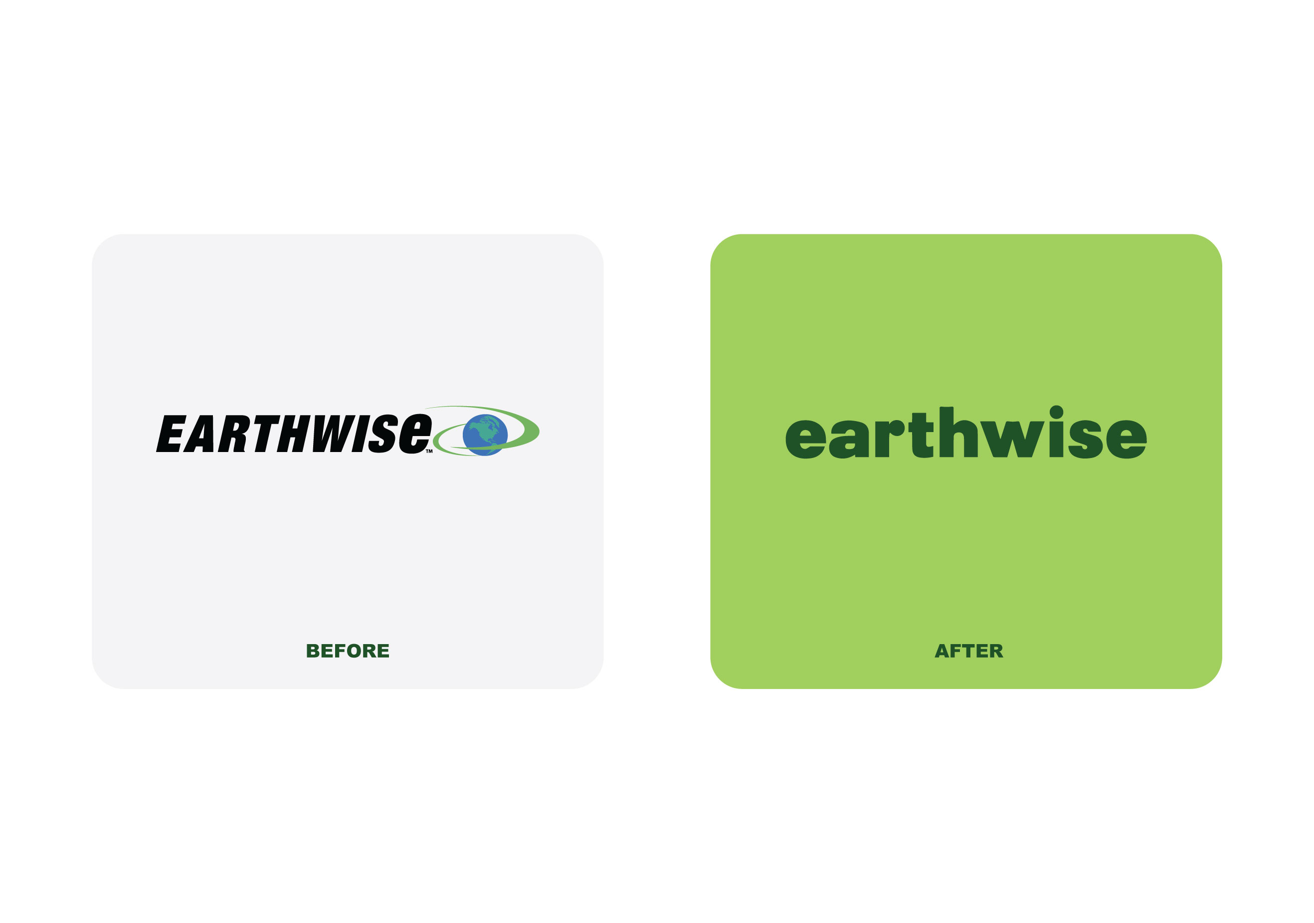
- Redesigned the logo, stripping away the dated globe-orbit mark in favor of a clean, confident lowercase wordmark built for modern retail and digital environments.
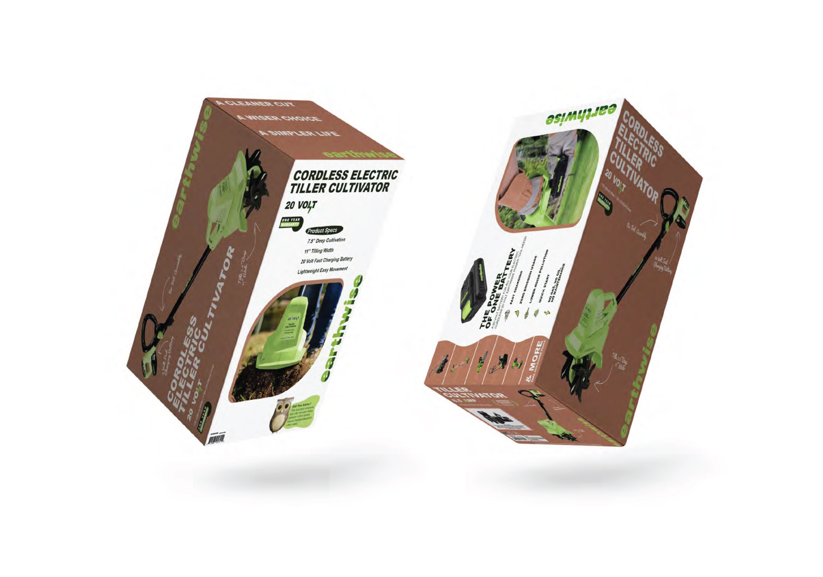
- Rebuilt retail packaging from the ground up, shifting from spec-heavy layouts to lifestyle-led storytelling with simplified visual hierarchy and human use-case photography.
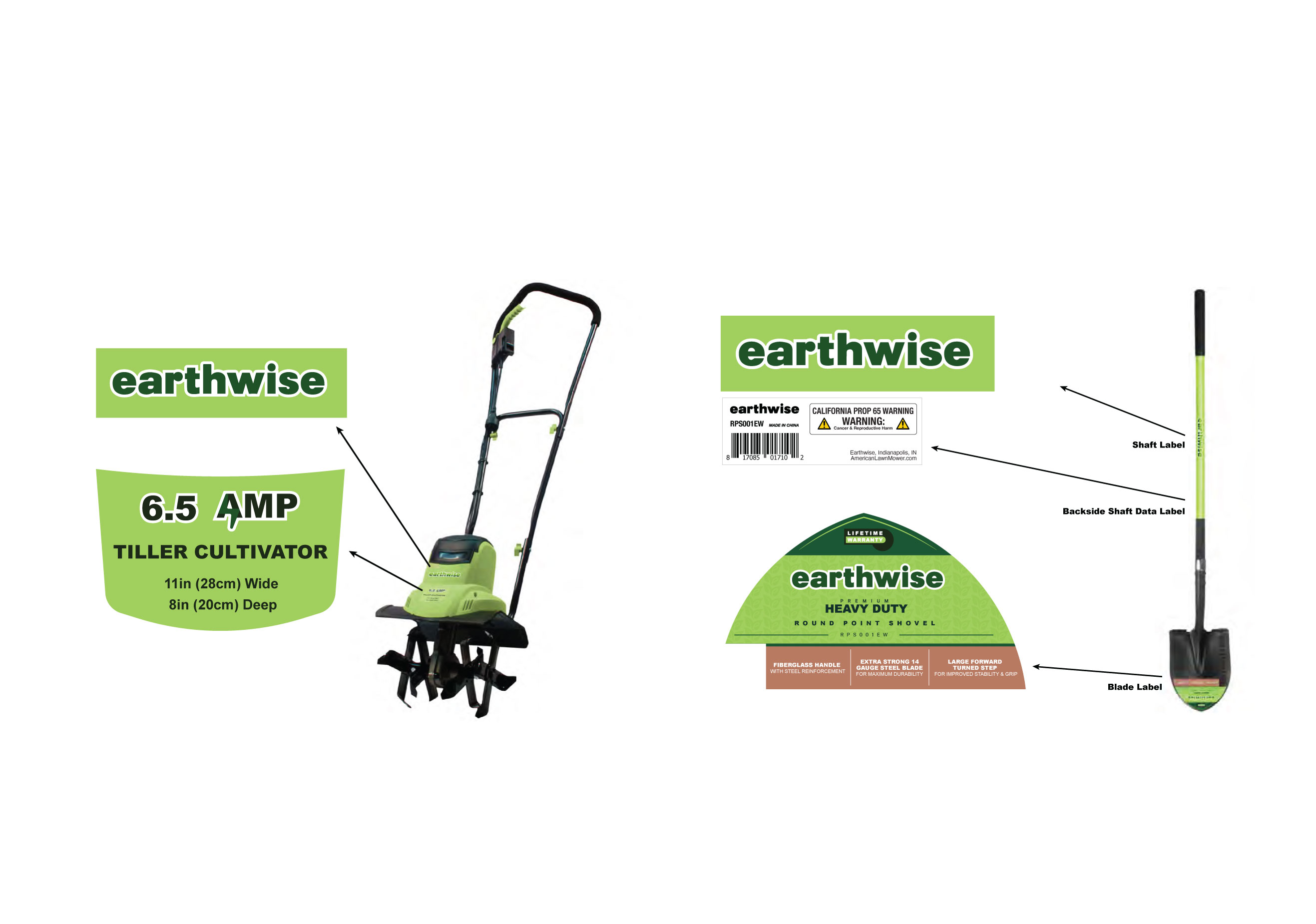
- Developed a scalable design and communication language applied across packaging, product shaft labels, blade labels, and hang tags.
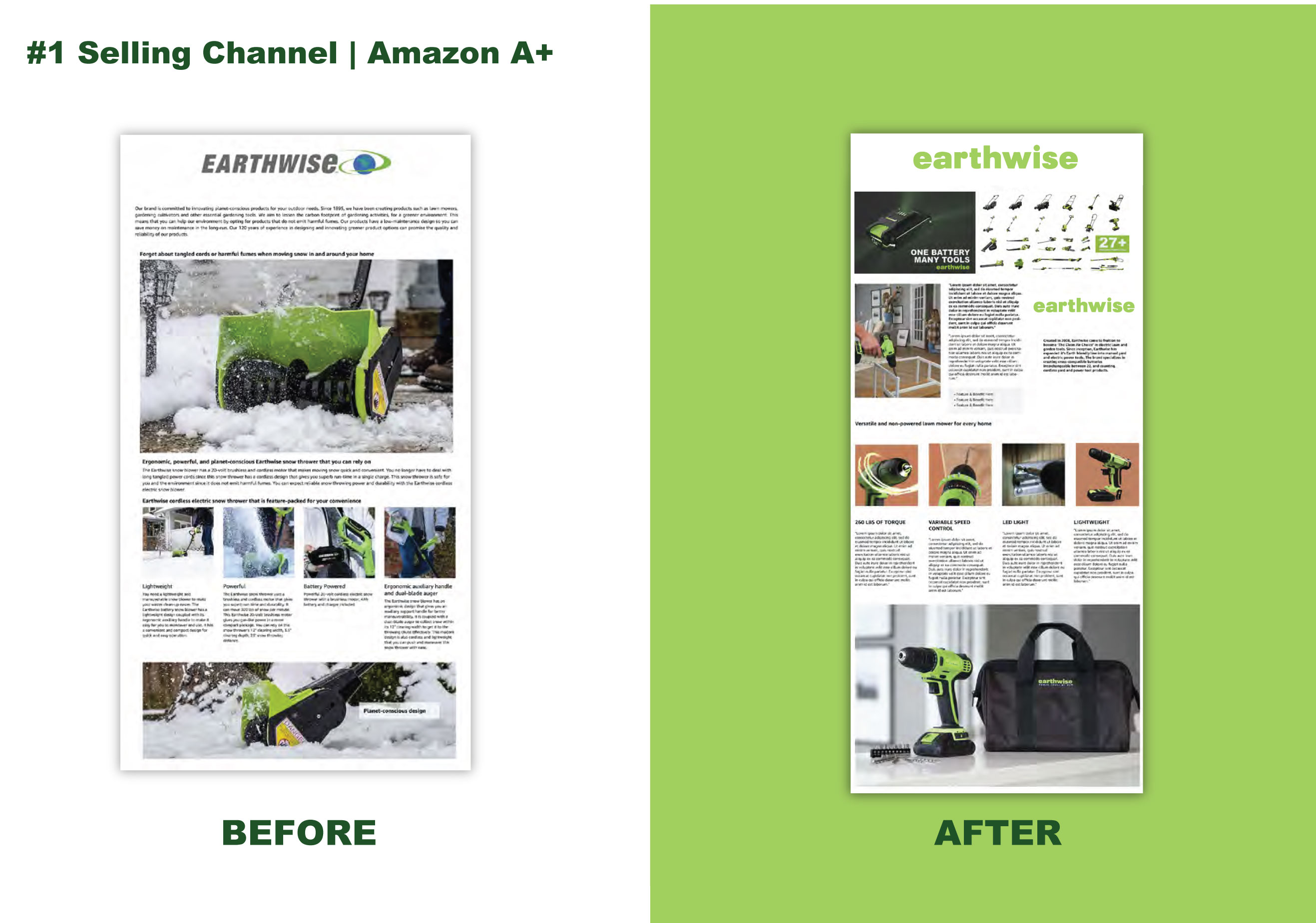
- Redesigned Amazon A+ content to match the new brand system, improving brand consistency in the brand's highest-volume sales channel.
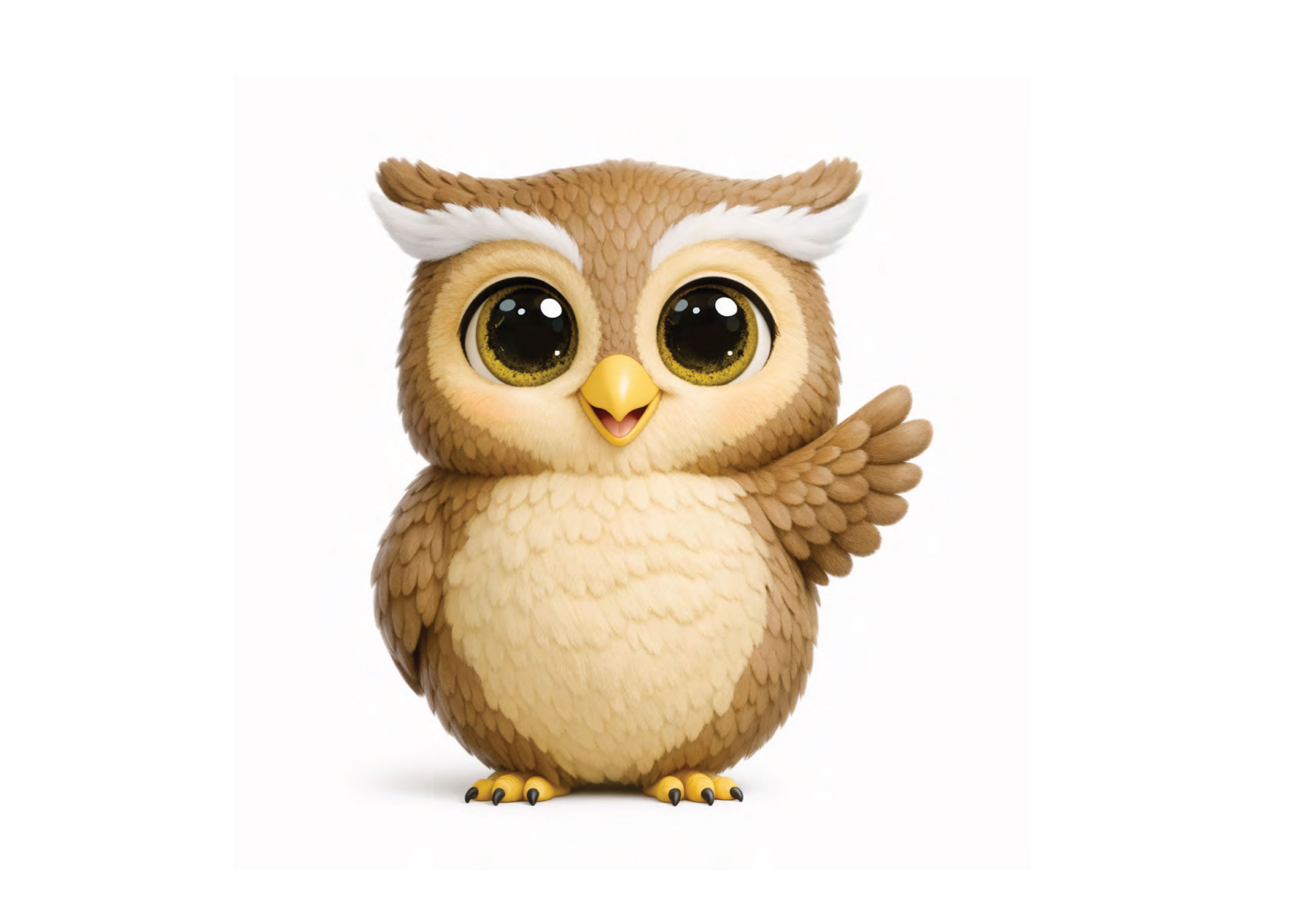
- Introduced an owl mascot character to deliver "Did You Know?" sustainability moments across packaging and marketing, giving the brand a warm, approachable voice that made eco-friendly messaging feel personal rather than technical.


Achieved Goals
Full Portfolio Unified packaging system across product lines
Amazon A+ Redesigned content in the brand's #1 selling channel
Shelf to Screen Consistent visual identity from retail packaging to digital listings
Mascot Proprietary brand character introduced as a recurring customer touchpoint